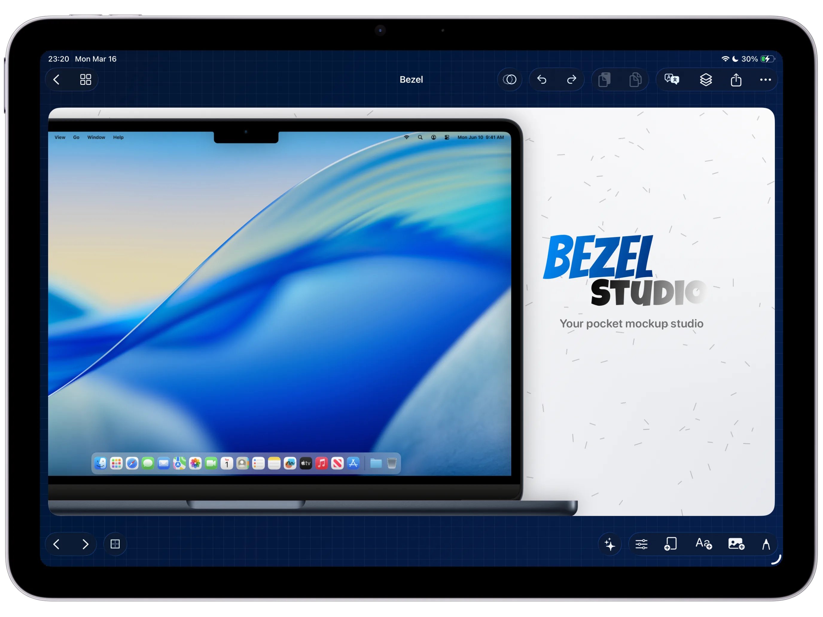
How-To Guide 08
How to style App Store captions with gradients, shadows, strokes, and glass text.
Strong App Store captions do more than sit on top of the screenshot. They establish hierarchy, frame the promise of the screen, and make the whole iPhone mockup feel intentional before the user ever taps into the next card.
What You'll Build
A reusable caption treatment for App Store screenshots that reads clearly on both iPhone and iPad layouts.
What You'll Use
Caption hierarchy, gradients, shadows, strokes, glass-like fills, and background contrast.
Screenshot Plan
Show 1 finished caption system, 1 hierarchy setup, 2 styling passes, 1 background adjustment, 1 multi-canvas carryover, and 1 export comparison.
Step 01
Write the caption hierarchy before styling it.
Start with the short headline, support line, and emphasis word that actually sell the screen. Styling helps later, but the structure has to read cleanly on top of the screenshot first.
Screenshot To Add
A clean canvas with the raw screenshot and a first-pass caption hierarchy before decorative styling is applied.
Step 02
Apply the core text style with weight, alignment, and spacing.
Use the controls from the App Store screenshot typography and captions feature page to lock the main font weight, line spacing, and alignment. The visual effect only works if the basic reading rhythm is already stable.
Screenshot To Add
Typography controls visible while the headline weight, spacing, and alignment are refined.
Step 03
Add gradients, strokes, shadows, or glass-like treatments carefully.
Choose one or two accent moves instead of piling everything on the same word. A gradient headline, a tight shadow, or a subtle glass treatment should sharpen the message rather than compete with it.
Screenshot To Add
A styled caption showing the chosen gradient, stroke, or shadow treatment against the screenshot.
Step 04
Pair the caption treatment with a supportive background.
Open the App screenshot backgrounds and canvas styling feature page if the text still fights the layout. Slight background adjustments usually make the caption feel premium without forcing heavier shadows or thicker outlines.
Screenshot To Add
A before-and-after background pass showing how contrast improves the caption treatment.
Step 05
Carry the caption system into more canvases and devices.
Duplicate the same caption system into a second canvas so the style becomes repeatable, then move into the layers and 3-axis transforms guide when the layout needs more depth than typography alone can provide.
Screenshot To Add
The caption system duplicated into a second canvas or device size without losing its hierarchy.
Step 06
Export and compare the styled version against the raw screen.
Check the final still at the same scale you expect to ship. The right caption treatment should make the screen easier to understand immediately, and it should still hold up later when you enter the export stills and videos workflow.
Screenshot To Add
The final styled screenshot placed next to the raw screen for an export-quality comparison.